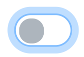
Toggle button
This element is a basic toggle button. The graphic origin of the Toggle button corresponds with the geometric center of the Toggle button.
The difference between button and toggle button is the state keeping behavior of the toggle button. Indeed, when you click on it, toggle button changes its state to the other one. You have to click again to go back on the first state.
As button behavior, toggle button can be disabled. In this case, cliking on it doesn't have any effect on toggle button element.
Only width size can be configured. Height size automatically changes to keep the best size proportion of the Toggle Button element.
This element must be used with HMI context.
Icon

HMI Representation

External parameters
You can edit the units
Show/Hide all parameters
| parameter | editable via "Parameter" tab | updatable via a controller | description | default unit | type |
|---|---|---|---|---|---|
| X-axis position | ✔️ | ✔️ | Position of the element on the X-axis. | px | Integer number |
| Y-axis position | ✔️ | ✔️ | Position of the element on the Y-axis. | px | Integer number |
| Width | ✔️ | ✔️ | Length of the element on the X-axis. | px | Integer number |
| Button is checked | ✔️ | ✔️ | This parameter allows you to choose the initial state of the toggle button, between checked and unchecked. | - | Enumeration (unchecked, checked) |
| Button is disabled | ✔️ | ✔️ | This parameter allows you to choose if toggle button is clickable or not on the scene during the execution of the scenario. | - | Enumeration (❌, ✔️) |
| Visibility | ✔️ | ✔️ | This parameter allows you to choose if you want the element to be visible or not on the scene during the execution of the scenario. If the item is part of a group, it can inherit the value of that group. | - | Enumeration (visible, hidden, inherit) |
| Angle | ✔️ | ✔️ | Angle of rotation of the element compared to its initial position. | degree | Decimal number |
| Uncheck Image | ✔️ | ✔️ | SVG image that will be displayed when the togglebutton is unchecked when the case "Check Image" is also filled. Make sure your SVG is valid before entering a value in field. Choose a preset definition. | - | Text |
| Check Image | ✔️ | ✔️ | SVG image that will be displayed when the togglebutton is checked when the case "Uncheck Image" is also filled. Make sure your SVG is valid before entering a value in field. Choose a preset definition. | - | Text |
Triggered behaviours
See Actions page for more explanation.
Show/Hide all triggered behaviours
Destroy��
At the reception of the flow, the element is destroy.
No parameters for this triggered behaviour.
Events
See Events page for more explanation.
Show/Hide all events
| event | description |
|---|---|
| On Parameter Value Changed | The element can send information to the model when the value of the selected parameter has changed |
| At initialization | The toggle button can send information to the model once at initialization |
| Continually | The toggle button can send information to the model continuously |
| Checked | The toggle button can send information to the model when you check the toggle button |
| Unchecked | The toggle button can send information to the model when you uncheck the toggle button |
Tips
You can also create SVG customized arrow or from a template in svg edition window. See Arrow Edition Mode